Mics
ㅤ
Client:
Graphicyoon
Industry:
Nonprofit Organization
Services:
• Brand Identity Design
• Visual Language System
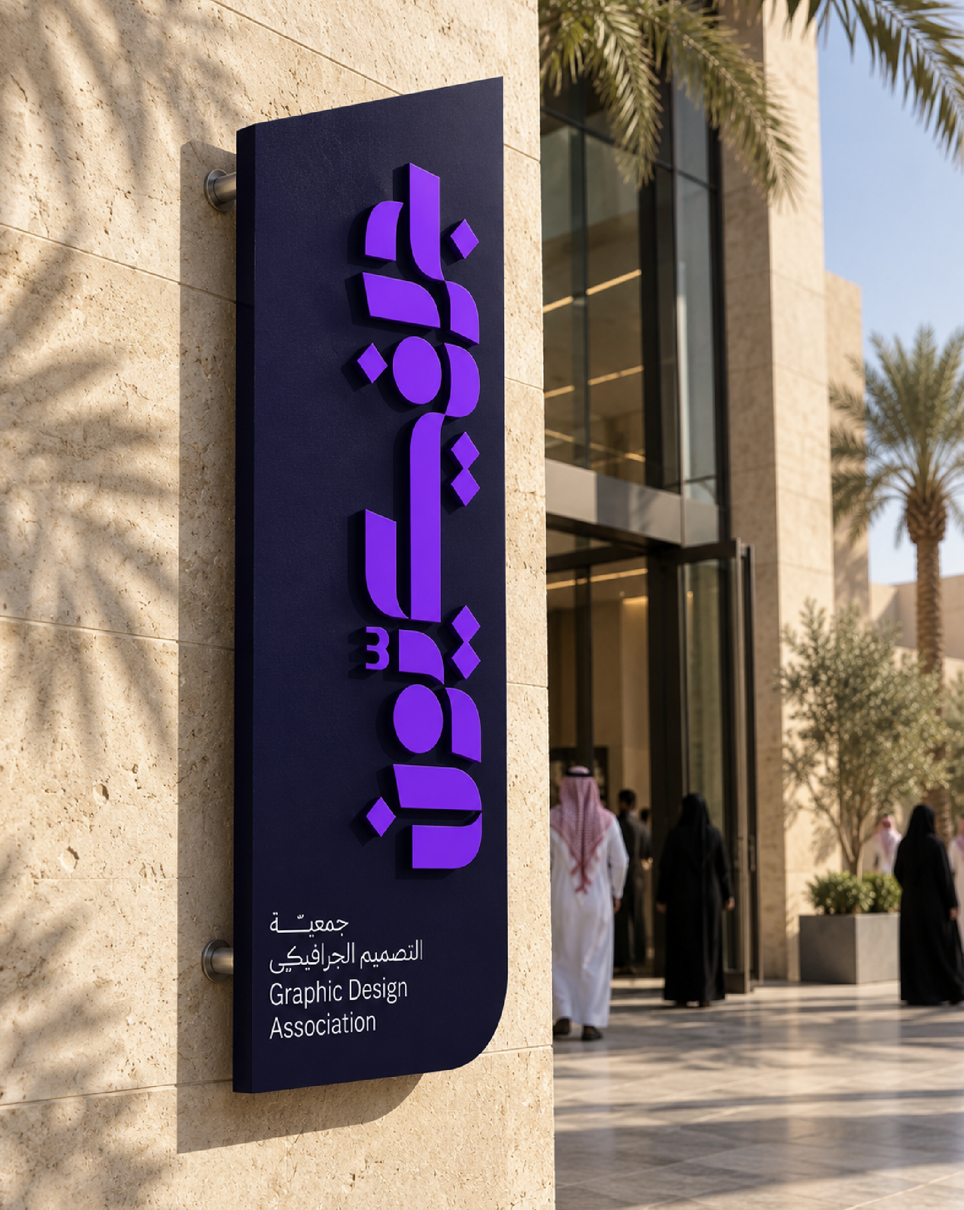
Graphicyoon is the Graphic Design Association, a Saudi community dedicated to inspiring and developing design makers.
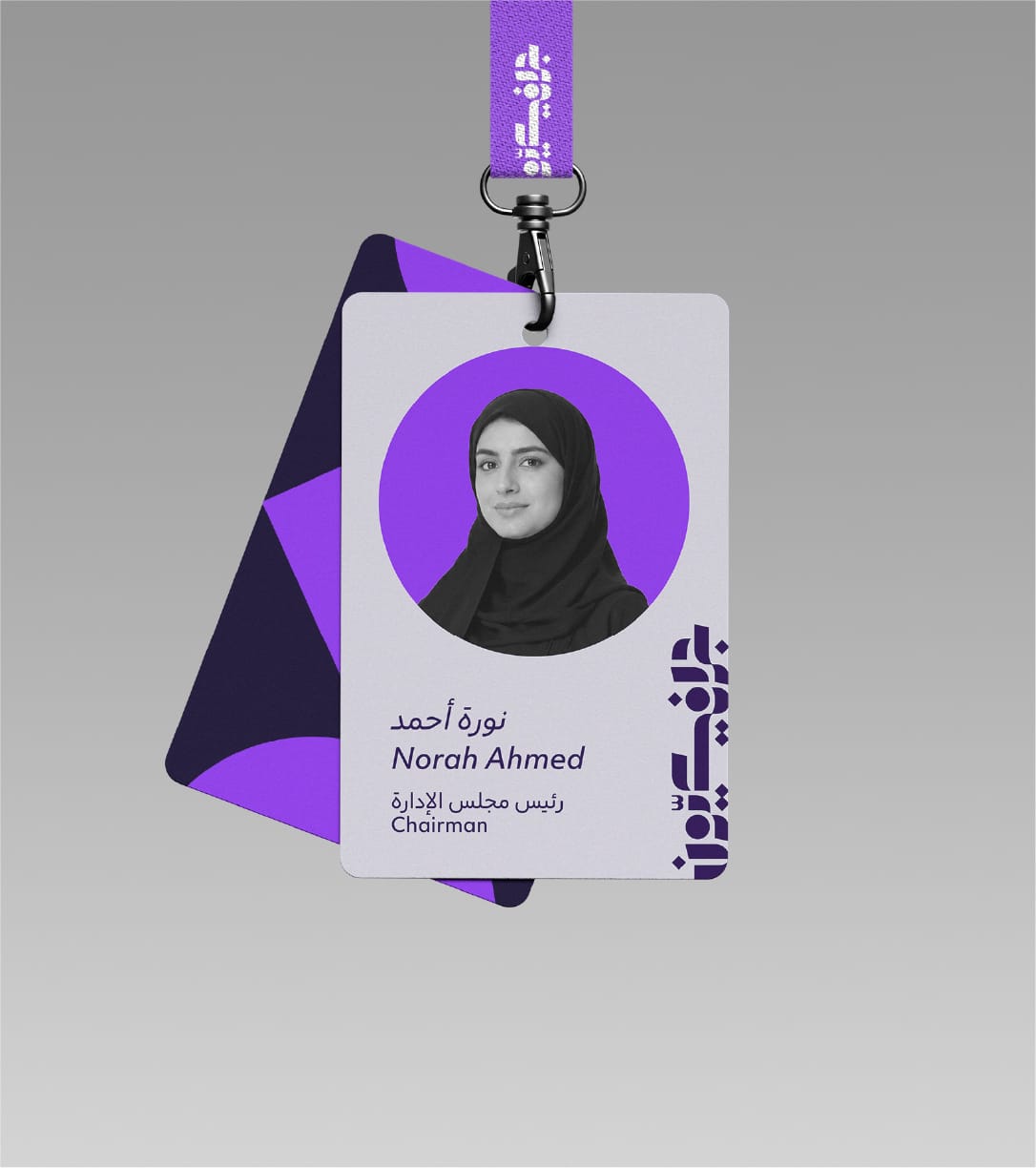
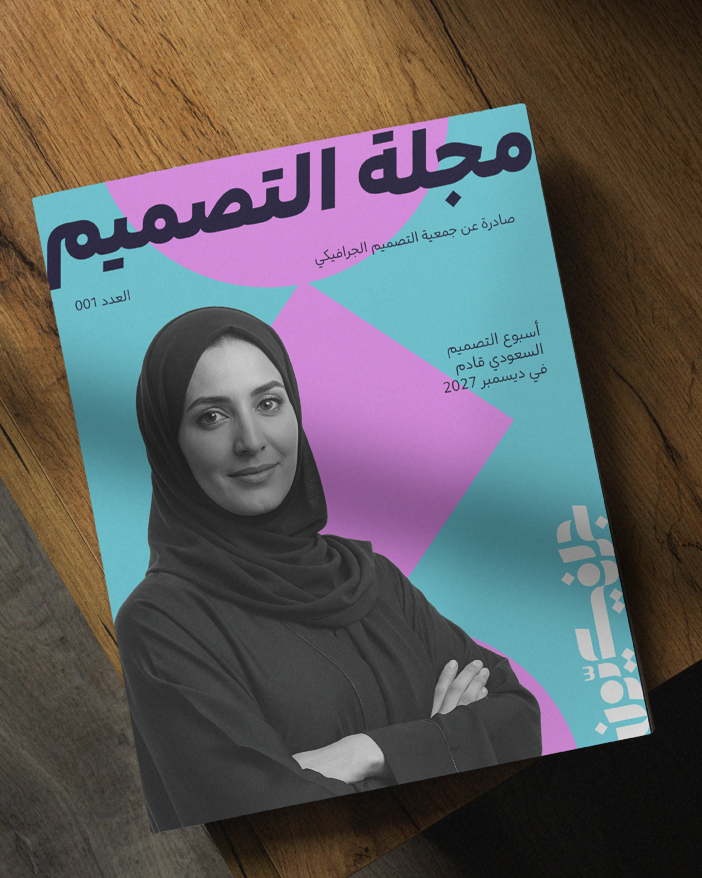
We developed a visual identity that reflects the diversity of the graphic design community while creating a distinctive system that belongs to the association itself. Built around the idea that an association dedicated to design should not simply follow existing design rules, the identity was created with the freedom to define its own.
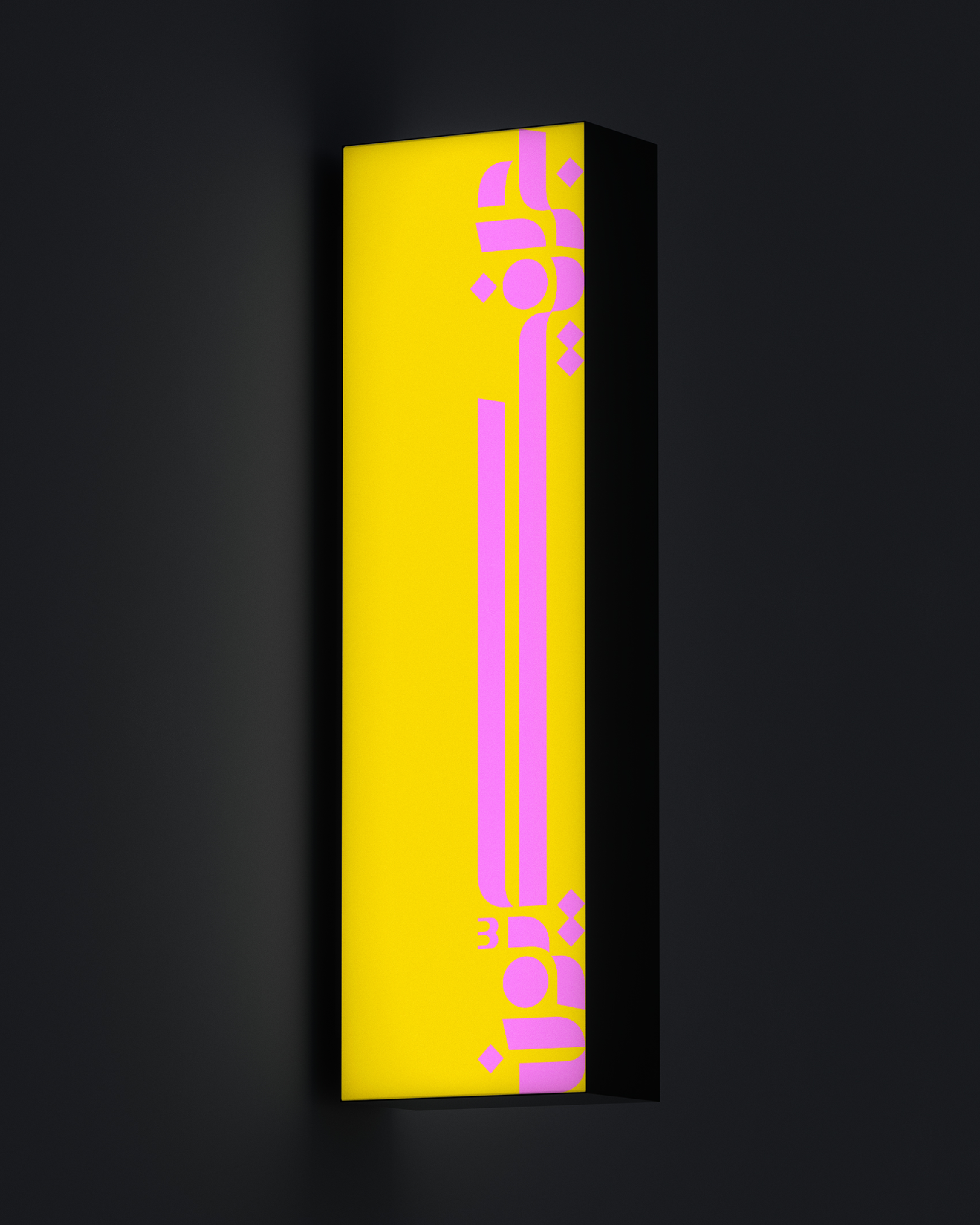
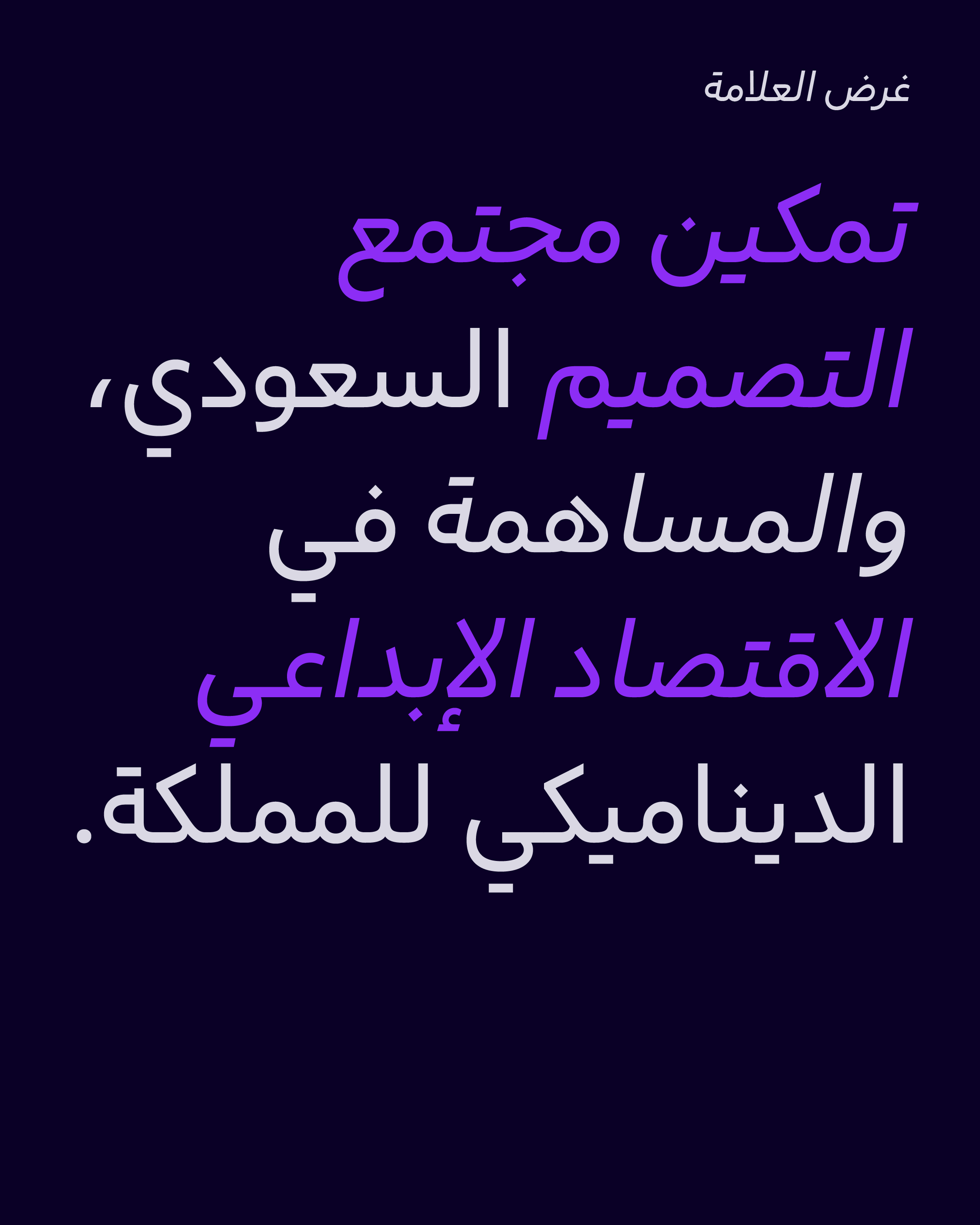
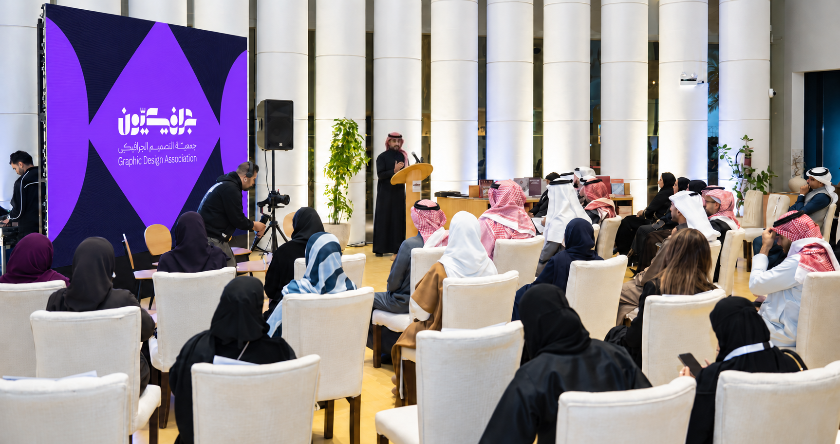
As an association dedicated to graphic design, Graphicyoon represents a diverse community of designers, creative disciplines, perspectives, and approaches.
The challenge was to develop a visual identity that could reflect this diversity without limiting the association to one fixed visual expression. As a Saudi association, the identity also needed to reflect its local context without relying on a single cultural symbol or conventional representation.
The Challenge Lies In:
• How to create an identity that reflects the diversity of the design community.
• How to build a recognizable system without relying on fixed compositions or rigid visual rules.
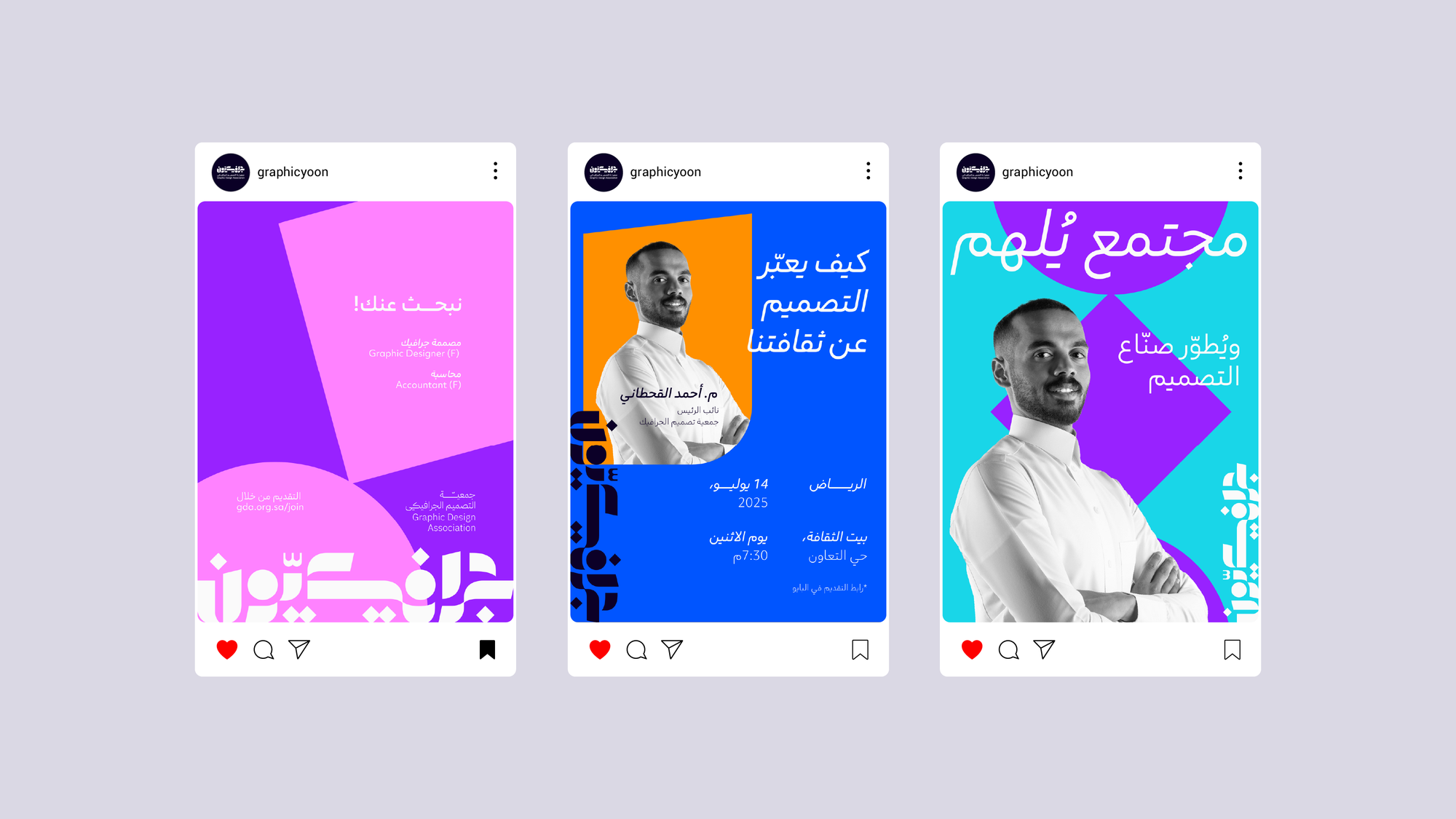
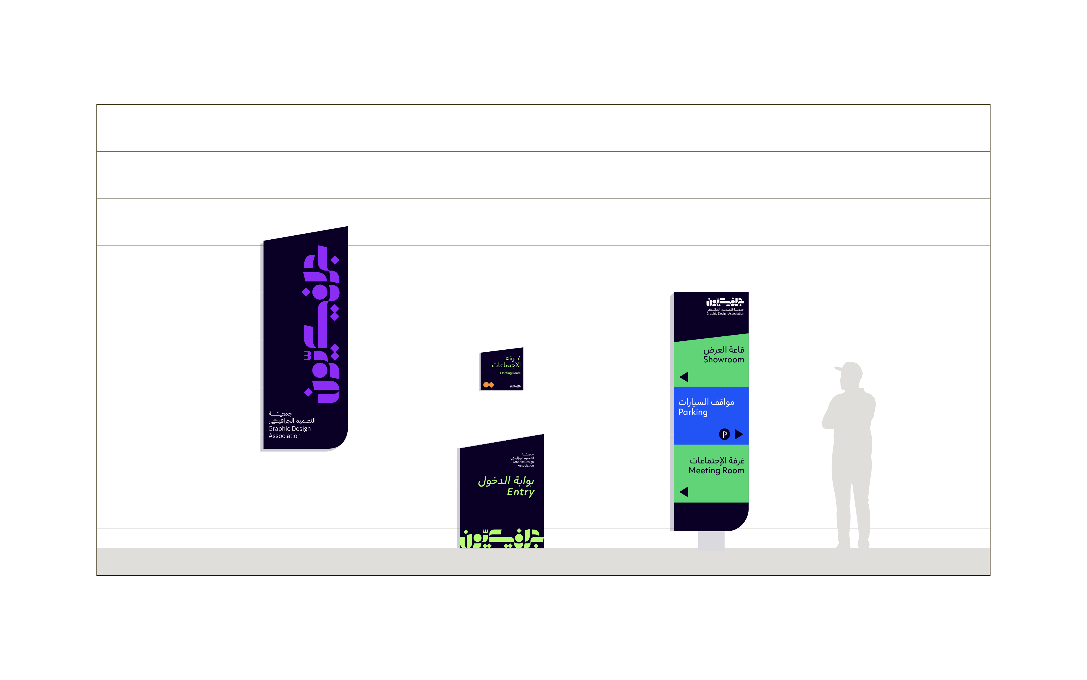
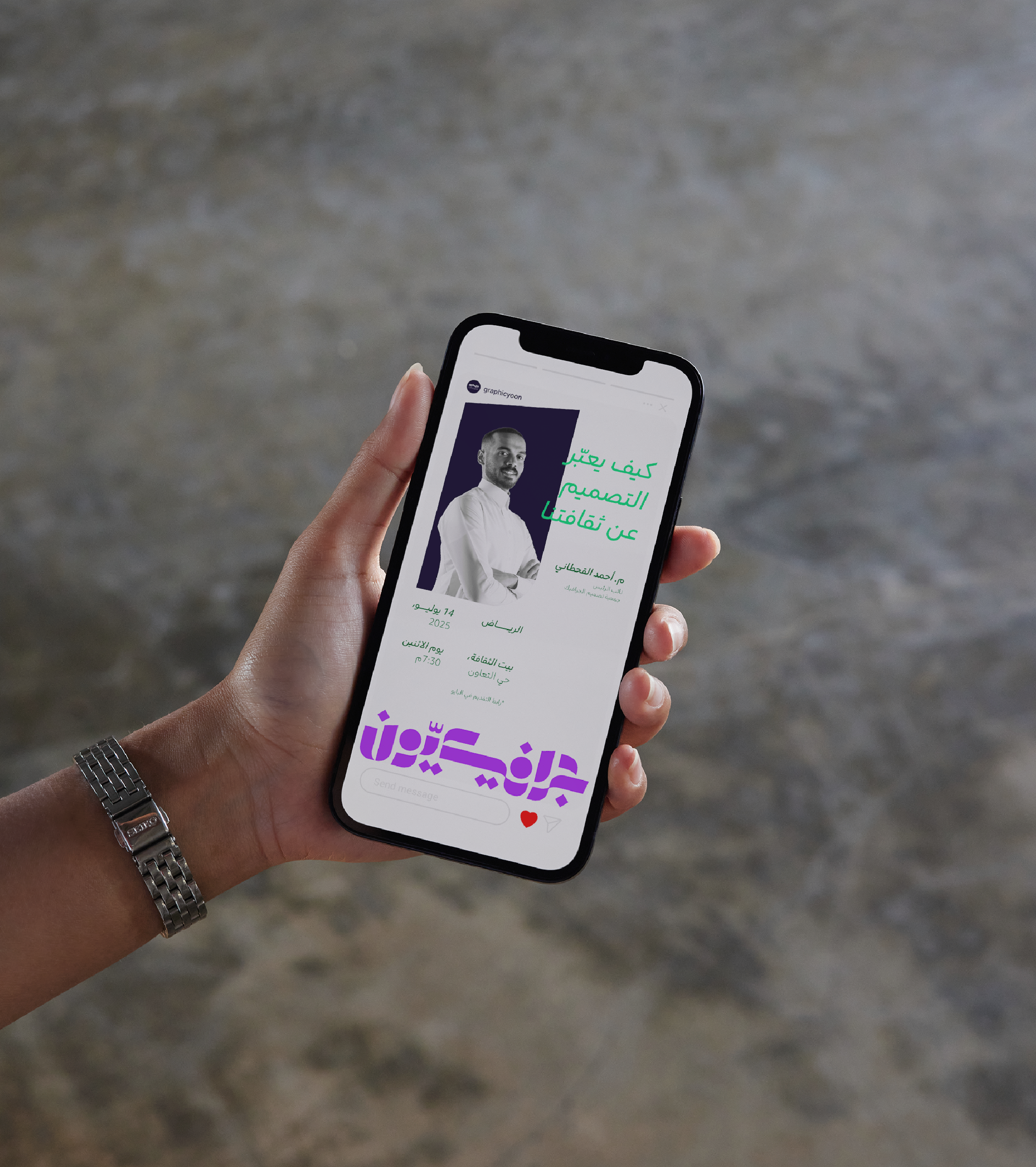
• How to create a flexible visual language that can adapt across different content, platforms, and applications.
• How to reflect Saudi Arabia through a diverse visual perspective rather than a single cultural reference.
To create an identity that reflects the nature of graphic design itself, we developed Graphicyoon as a flexible visual system with the freedom to define its own rules.
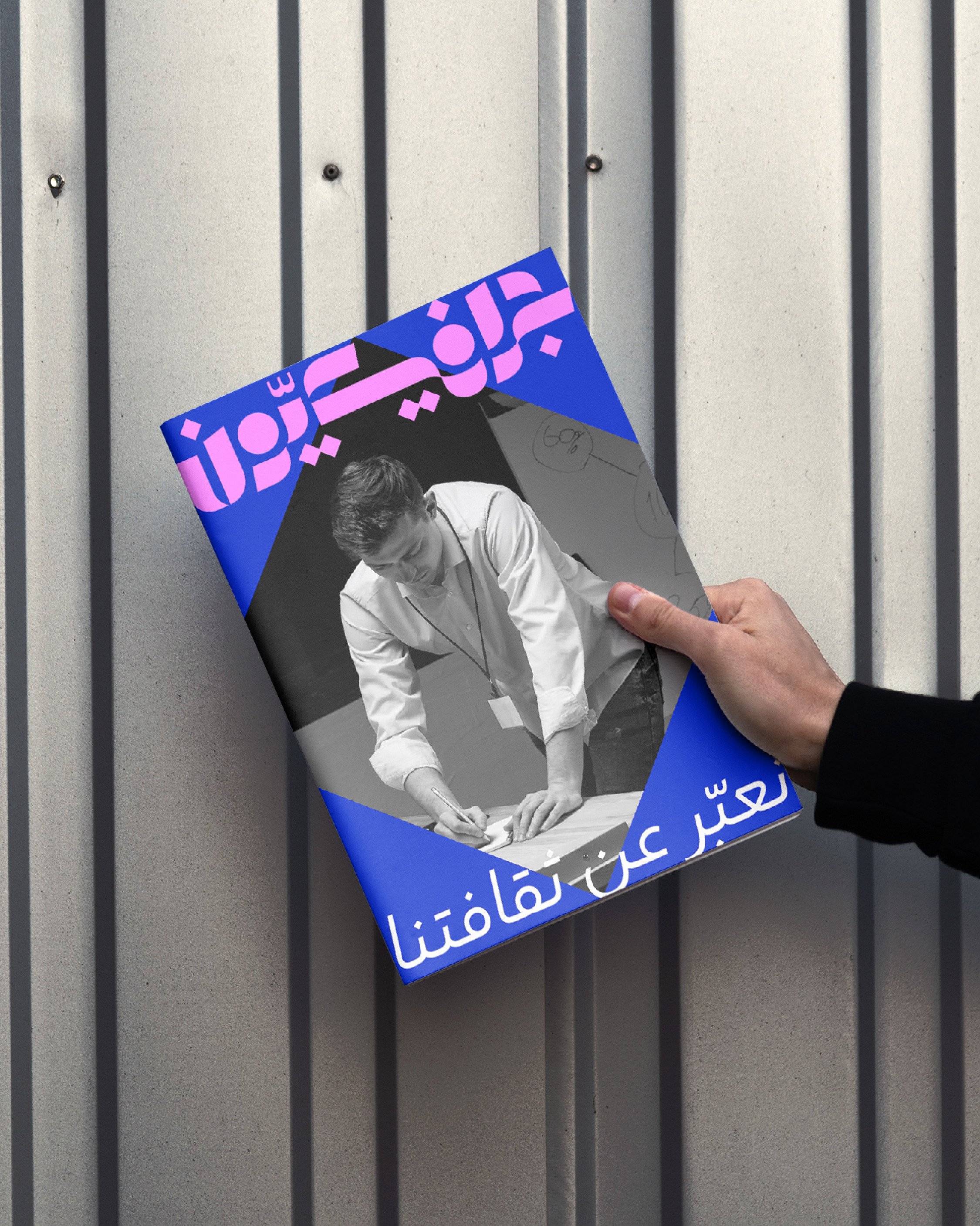
Rather than building the identity around fixed margins, predetermined compositions, or colors assigned to specific meanings, we created a visual language that allows its elements to adapt, interact, and evolve across different expressions. The system creates consistency through its own distinctive elements while leaving room for experimentation and variation.
We achieved this through:
• A distinctive visual system that allows compositions to adapt rather than follow a single fixed layout.
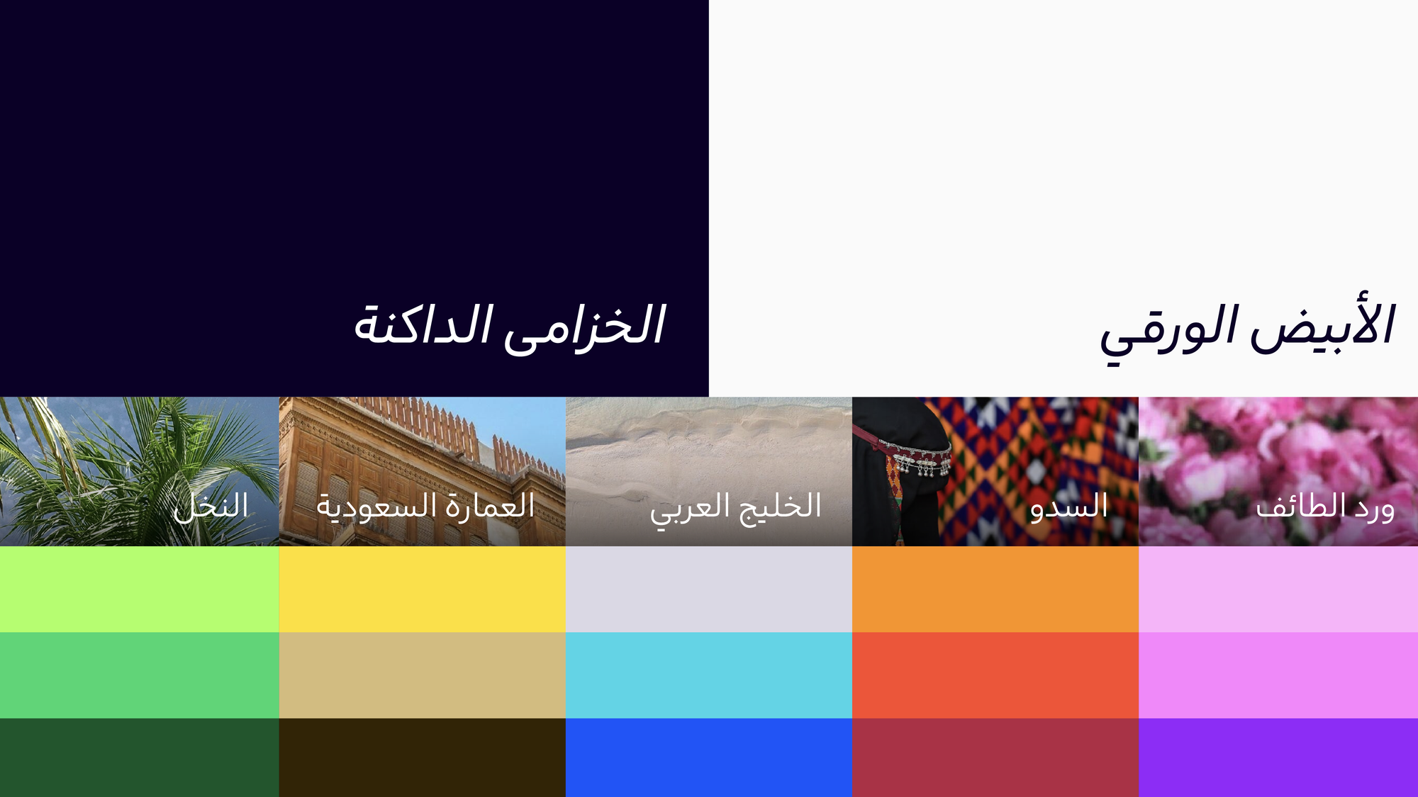
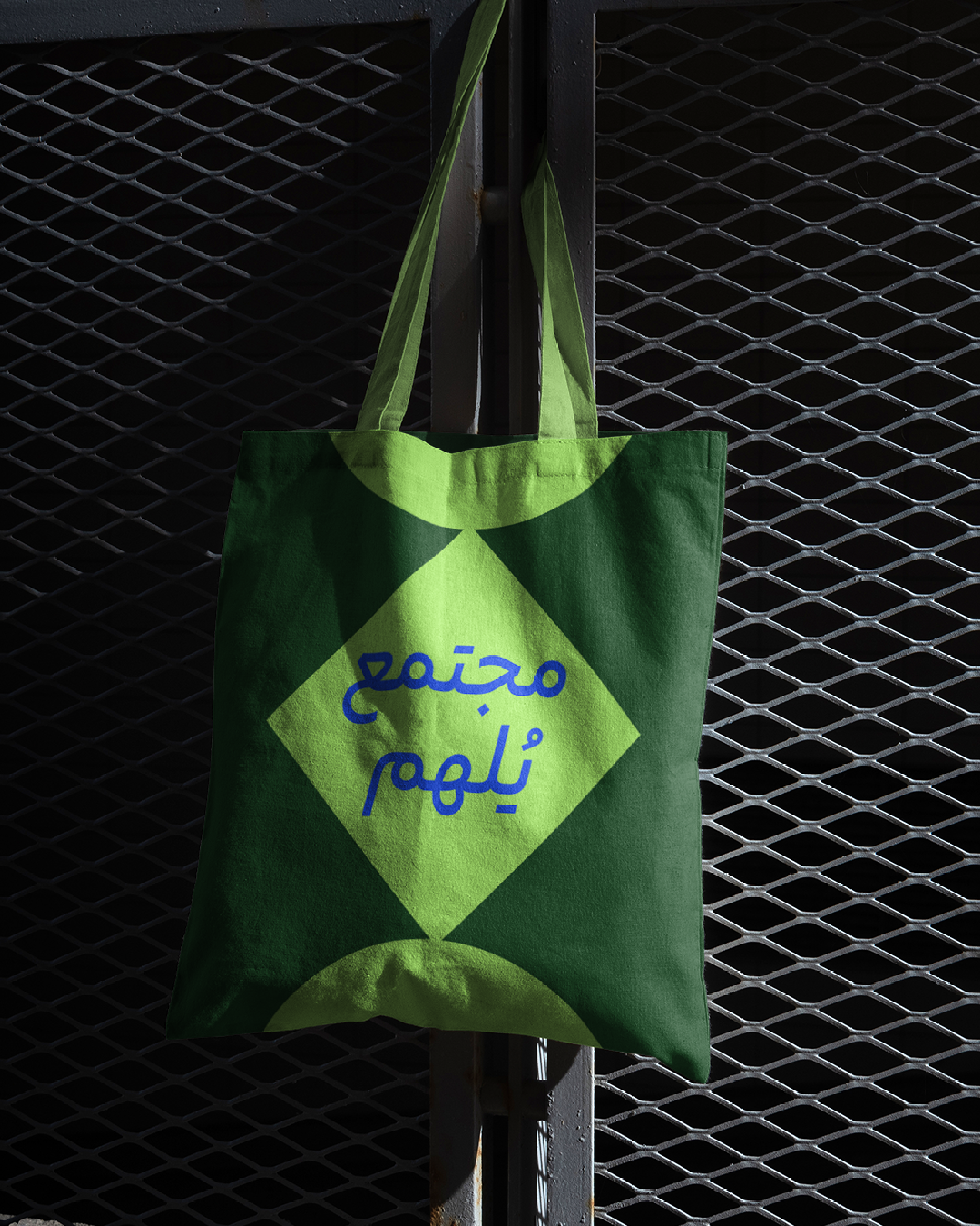
• A flexible color palette that celebrates diversity and difference while drawing inspiration from the richness of Saudi Arabia.
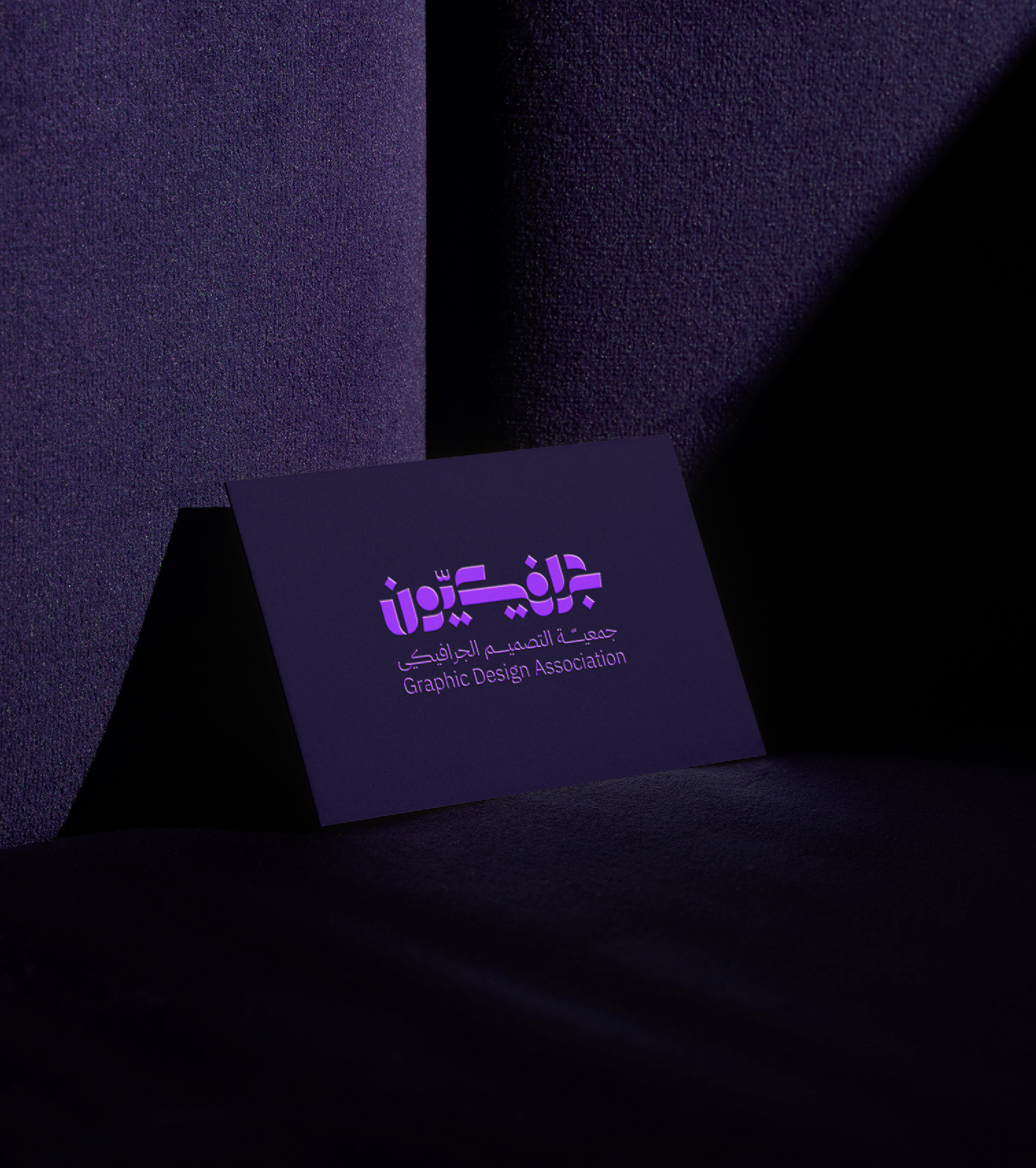
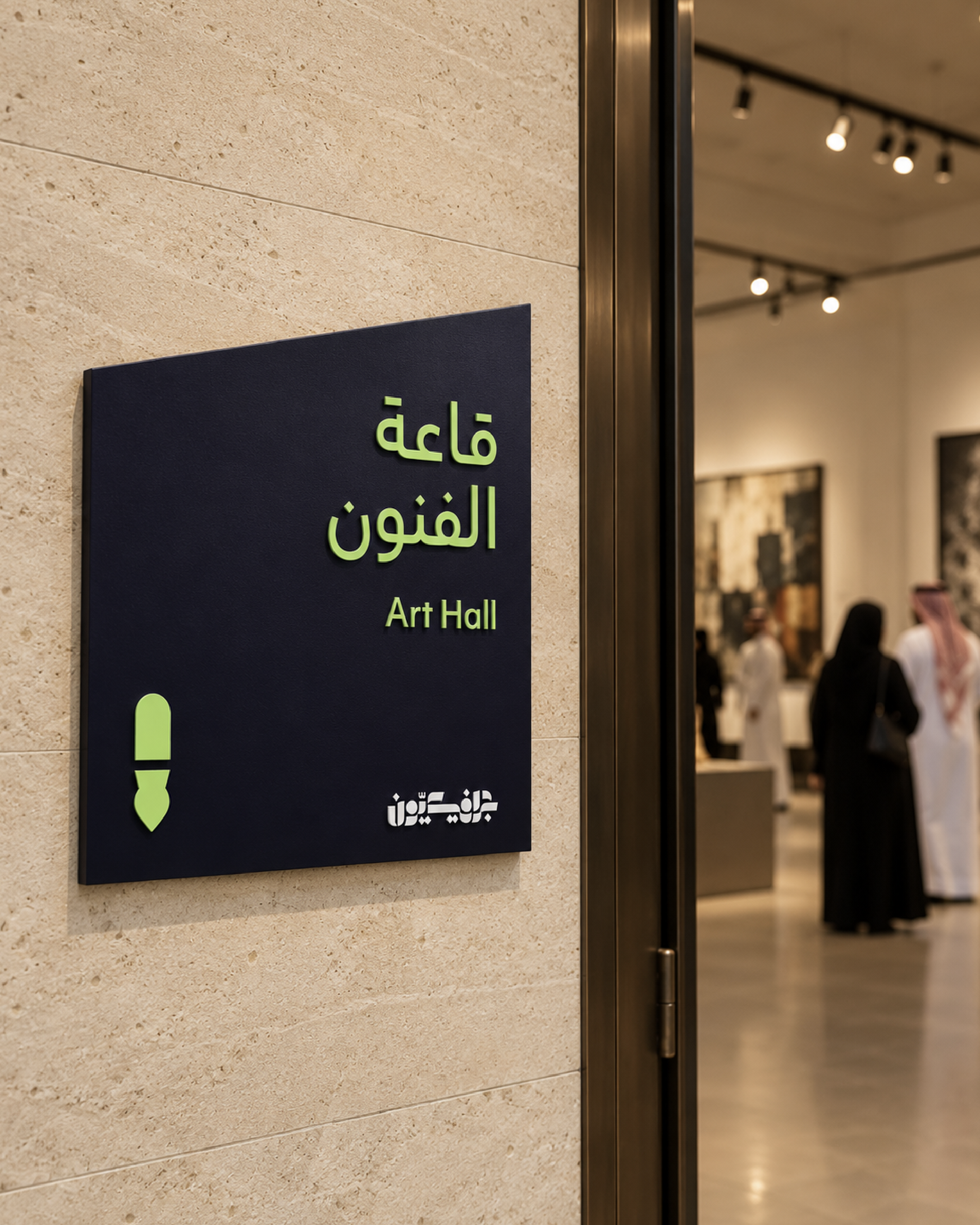
• Graphic elements derived from the geometry of the Graphicyoon logo, creating a recognizable visual language across applications.
• A visual framework that balances creative freedom with consistency, allowing the identity to create its own rules as it evolves.